OBSELETE: With the Design Support Library announced during IO15 comes the CollapsingToolbarLayout which is much more powerful, elegant and easier to use. Use it!
The ToolBar is a widget introduced by Google through the app-compat version 21 last fall. It basically replaces the good old ActionBar and bring much more controls on it. Styling and customisation is also much easier because you directly integrate the ToolBar into your view hierarchy, giving you all the benefits of the View class.
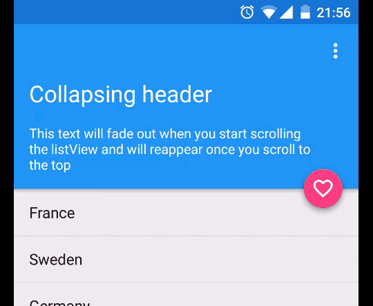
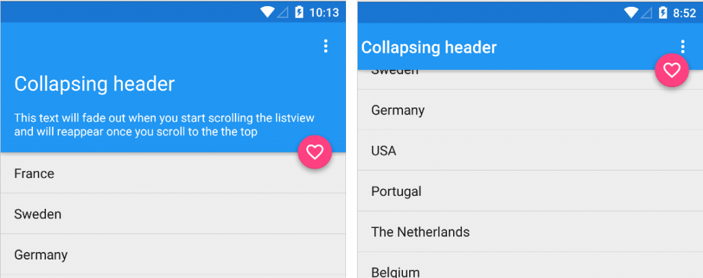
One issue with this extended version of the action bar is the height it can takes on the screen. And collapsing the toolbar’s content while scrolling a list is tricky.
Objectives:
Fade out the white text when we start scrolling and display the toolbar’s title. Reverse it when the we scroll up to the top. Make the Floating Action Button follow the edge of the header. Support properly the elevation on Lollipop.
TL;DR: The whole source code is available on my github.
First step, from a layout perspective, it is pretty simple and straight forward: I use a ToolBar, a ListView and a Floating Action Button:
<RelativeLayout xmlns:android="http://schemas.android.com/apk/res/android"
xmlns:app="http://schemas.android.com/apk/res-auto"
xmlns:tools="http://schemas.android.com/tools"
xmlns:fab="http://schemas.android.com/apk/res-auto"
android:layout_width="match_parent"
android:layout_height="match_parent"
android:orientation="vertical"
tools:context=".MainActivity">

<android.support.v7.widget.Toolbar
    android:id="@+id/toolbar"
    android:layout_width="match_parent"
    android:layout_height="wrap_content"
    android:elevation="4dp"
    android:background="?attr/colorPrimary"
    app:theme="@style/ThemeOverlay.AppCompat.Dark.ActionBar"/>

<ListView
    android:id="@+id/listview"
    android:layout_below="@+id/toolbar"
    android:layout_width="match_parent"
    android:layout_height="match_parent"/>


<com.getbase.floatingactionbutton.FloatingActionButton
    android:layout_width="wrap_content"
    android:layout_height="wrap_content"
    android:id="@+id/favorite"
    android:layout_alignBottom="@+id/toolbar"
    android:layout_alignParentRight="true"
    android:layout_alignParentEnd="true"
    android:layout_marginRight="8dp"
    android:layout_marginEnd="8dp"
    android:elevation="8dp"
    android:layout_marginBottom="-32dp"
    fab:fab_icon="@drawable/ic_favorite_outline_white_24dp"
    fab:fab_colorNormal="@color/accent"
    fab:fab_size="mini"
    />
</RelativeLayout>
Then, I use another layout containing the header’s TextViews. I inflate it in my Activity and attach it to the ListView using mListView.addHeaderView(view);.
<?xml version="1.0" encoding="utf-8"?>
<FrameLayout xmlns:android="http://schemas.android.com/apk/res/android"
android:layout_width="match_parent"
android:layout_height="wrap_content"
android:elevation="4dp"
android:background="?attr/colorPrimary">
<LinearLayout
    android:layout_width="match_parent"
    android:layout_height="wrap_content"
    android:id="@+id/container"
    android:orientation="vertical"
    android:paddingLeft="16dp"
    android:paddingRight="16dp"
    android:paddingBottom="16dp" >

    <TextView
        android:layout_width="match_parent"
        android:layout_height="wrap_content"
        android:textColor="@color/icons"
        android:textSize="24sp"
        android:text="@string/title"/>

    <TextView
        android:layout_width="match_parent"
        android:layout_height="wrap_content"
        android:layout_marginTop="16dp"
        android:textColor="@color/icons"
        android:textSize="14sp"
        android:text="@string/description"/>

</LinearLayout>
</FrameLayout>
To react on the scroll event, we need to listen to the AbsListView.OnScrollListener. In the method onScroll. we simply check if the top position of the first list item visible and if it is the item #0. Finally, if its Y position is more than -16dp, we display the header’s content and hide the ActionBar’s title. Otherwise, it is the opposite.
if (view != null && view.getChildCount() > 0 && firstVisibleItem == 0) {
    if (view.getChildAt(0).getTop() < -dpToPx(16)) {
        toggleHeader(false, false);
    } else {
        toggleHeader(true, true);
    }
}
The toggleHeader function is shown below. It starts an ObjectAnimator controlling the alpha property from the current opacity and toggle the visibility of the title.
private void toggleHeader(boolean visible, boolean force) {
if ((force && visible) || (visible && mContainerHeader.getAlpha() == 0f)) {
    fade.setFloatValues(mContainerHeader.getAlpha(), 1f);
    fade.start();
} else if (force || (!visible && mContainerHeader.getAlpha() == 1f)){
    fade.setFloatValues(mContainerHeader.getAlpha(), 0f);
    fade.start();
}
// Toggle the visibility of the title.
if (getSupportActionBar() != null) {
    getSupportActionBar().setDisplayShowTitleEnabled(!visible);
}
}
To polish the effect, you can coordinate the ToolBar and headerView’s elevation and update the Y position of the FAB so it always follow the edge of our header. Here’s a last snippet of code to do so:
public void onScroll(AbsListView view,
                    int firstVisibleItem,
                    int visibleItemCount,
                    int totalItemCount) {
   if (view != null && view.getChildCount() > 0 && firstVisibleItem == 0) {
       int translation = view.getChildAt(0).getHeight() + view.getChildAt(0).getTop();
       mFab.setTranslationY(translation>0  ? translation : 0);
   }

   if (isLollipop()) {
       if (firstVisibleItem == 0) {
           mToolbar.setElevation(0);
       } else {
           mToolbar.setElevation(dpToPx(4));
       }
   }
}
And this is the result: